Snowboarding Forum - Snowboard Enthusiast Forums banner

2011 NS SL-R. What color should it be matched with?

5.1K views 19 replies 11 participants last post by  Lstarrasl  
#1 · (Edited)
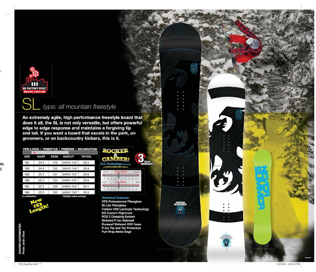
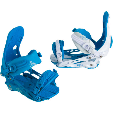
Hi I am planning to buy a 2011 NS SL-R after reading the reviews and the general love that this forum has for it. But my only problem in going ahead is how plain the color scheme is. I am leaning toward the White background version and I was wondering if anyone has suggestions on what color bindings would match well with the board. I don't want to stay in the range of black and white and probably going to include Stickers as well to jazz it up.

EDIT: Just for clarifying, I am planning to paint over my Missions. So really any color scheme I am up for, not just in production. I'm just not good at matching colors, Color illiterate if you will.

Thank you

Image
 
#2 ·
I wouldn't choose my bindings solely on the way they match the color to my snowboard...
But I know what you mean - it's nice to have a color-coordinated setup, but that shouldn't be your first concern. Figure out what binding you want, and see which color matches best to it. Like... Union Forces would be a good match, so maybe go with the blue to match the base text and the symbol.

Also, for reference (your picture doesn't have a shot of the base).
Image
 
#3 · (Edited)
Here is mine....do not copy it :cheeky4:


Image


Also find bindings you like and then a color not the other way around. Most of the binding is covered by your pants anyways and performance is a bigger deal. Hopefully the binders you choose also have a good color scheme you like otherwise oh well, performance wins!
 
#7 · (Edited)
Lol...
The flex meter is right there on the picture I posted... albeit somewhat blurry.
According to the NS scale, it's also 5.
Not sure how exactly that translates to the Burton scale, though.

From what I hear, the Burton supermodel is more of an all-mountain board, while the SLR is great for parks with big kickers...
You should the reviews to get a better idea. There's even one in the reviews section of the forum.
http://www.snowboardingforum.com/equipment-reviews/25192-never-summer-sl-2011-review.html

You should also keep in mind, NS boards are meant to last... They're hand-made, I believe, and the materials are superior to the materials used by Burton, and they have a 3 year warranty. And I've never heard of anyone snapping their NS boards, but I've heard it happening with Burton. For quality assurance, they bend their boards from tip to tail before selling them.
And speaking from personal experience, I rode a Burton blunt for the first few years of my snowboarding life, there have been tons of cracks and splits into it. And that was easy peasy beginner, mostly powder riding - I wouldn't dare use that board now.
 
#10 · (Edited)
I agree with the fact that you shouldn't grab bindings based on the sole factor of the color....but if you have found a solid set of binding I would try and get them in the teal/light blue that is highlighted on the board...Like the ones above...nice find!!

And I would choose the black board, murder it out. The teal outline on the bird sticks out more too and fits that other highlights on the board better than the white one.

And those skittel lookin binding that 'glade ripper' posted, my opinion, are played out and awful...they take aways from the board to much

Those are right up there with wearing five different colored cotton "tall t's" that seemed to sweep the nation last year, and they wonder why they are cold...
 
#14 ·
Why am i a poser because i want to find bindings that match my board? I can look at sites like thegoodride or the forums to see which bindings are good (which every1 is raving about 390s and forces) but that does not tell me what color it comes with. If im gonna spend good money on a board, might as well make it look nice no?

Why don't u go troll somewhere else

And for everyone else I am very grateful for your feedbacks
 
#19 ·
ಠ_ಠ I'm asking people in the forum for their feedback on colors so I can see if it looks good. I totally agree with people that say functionality over color. What I don't agree on is you calling me a poser.

If you see me on the hill with my matching bindings and board and standing by the lifts trying to look cool and not riding, go ahead and call me a poser. But if i have my "matching" gear and I'm working the park or riding the backcountry (even if im not great at it), then take your non-constructive criticism out of my face.